


 Path
Path
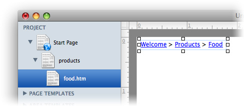
Show the path to the current page on your website to provide a clearer navigation.
You can add a path to every page area or area template. To add a path, edit the content of a page area or area template and drag the path from the elements panel to the editor.

A path shows the path from the current website back to the start page. Every page of the path is a link so that the visitors of your website can navigate to it.
Properties for Path
These properties can be set for a path. Select a path to show its properties.
| Item > Left | Sets the distance from the left side of the parent element in pixels. |
|---|---|
| Item > Top | Sets the distance from the top side of the parent element in pixels. |
| Item > Width | Sets the width of the item in pixels. |
| Item > Height | Sets the width of the item in pixels. |
| Item > Padding Left | Sets the distance from the left side of the item to the content in pixels. |
| Item > Padding Right | Sets the distance from the right side of the item to the content in pixels. |
| Item > Padding Top | Sets the distance from the top side of the item to the content in pixels. |
| Item > Padding Bottom | Sets the distance from the bottom side of the item to the content in pixels. |
| Item > Background Color | Select a background color for the item. |
| Item > Background Picture Clip | Select a background picture from the Goldfish Clips library. This option is only available if you have the Goldfish Clips library installed. |
| Item > Background Picture | Select a background picture for the item. With Repeat, you can choose how the picture will be displayed. |
| Item > Border Left Width | Displays a border on the left side of the item in the choosen width (pixels). |
| Item > Border Left Color | Select a color for the left border. |
| Item > Border Right Width | Displays a border on the right side of the item in the choosen width (pixels). |
| Item > Border Right Color | Select a color for the right border. |
| Item > Border Top Width | Displays a border on the top side of the item in the choosen width (pixels). |
| Item > Border Top Color | Select a color for the top border. |
| Item > Border Bottom Width | Displays a border on the bottom side of the item in the choosen width (pixels). |
| Item > Border Bottom Color | Select a color for the bottom border. |
Item > Add HTML Code  | Add custom html code to the item to extend Goldfish's functionality. |
| Item > Add CSS Code | Add custom css code to the item. The code will be stored in the css section of your website. You can't change the css code of internal items, but you can use the css code in your custom html code. |
| Item > Identifer (Id) | Sets the value for the id property. You can use this id to access the item with JavaScript. |
| Path > Font Style | The font style for the delemiter. |
| Path > Delemiter | Delemiter between two links. The default value is >. |
| Link Style > Font Style | The font style for links. |
Visual Effects
You can specify a visual effect, if your site visitor interacts with the path links (e.g. change the color if your site visitor moves his mouse over the link). The following properties are the same for Moving mouse over link effect, Clicking on link effect and Already visited link effect.
| Link Style > Change Font | Changes the font style of a menu item. |
|---|---|
| Link Style > Font Style | Sets the font style, to which will be changed. |
Did this help page answer your questions?
If you need additional assistance regarding this topic or if there's missing some information in this chapter, please write us.