


 Path & Sitemap
Show a sitemap or the path back to the start page. This works with a path & sitemap item that you can drag from the items to the website.
You can add a path & sitemap item to each area, slider area and area template. To add a path & sitemap item, edit the content of an area, slider or area template and drag a path & sitemap item from the items to the editor.

A path & sitemap item shows either the path back to the start page or an overview of all pages and subpages of the website (sitemap).
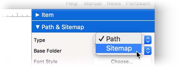
Select which of the two options you want to be displayed on the page at Path & Sitemap > Type in the properties.
Path
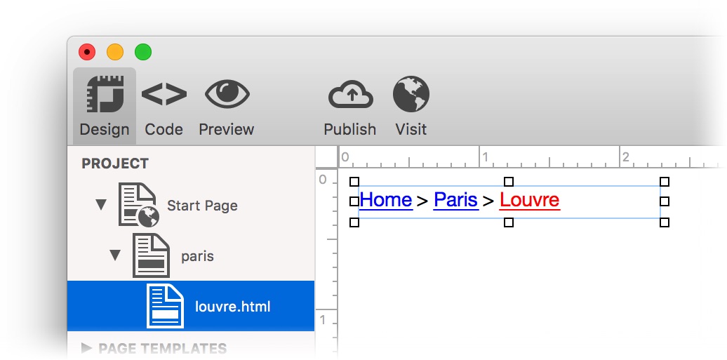
Path shows the path back to start page. Each entry can be clicked as a link to go to the corresponding page.
Sitemap
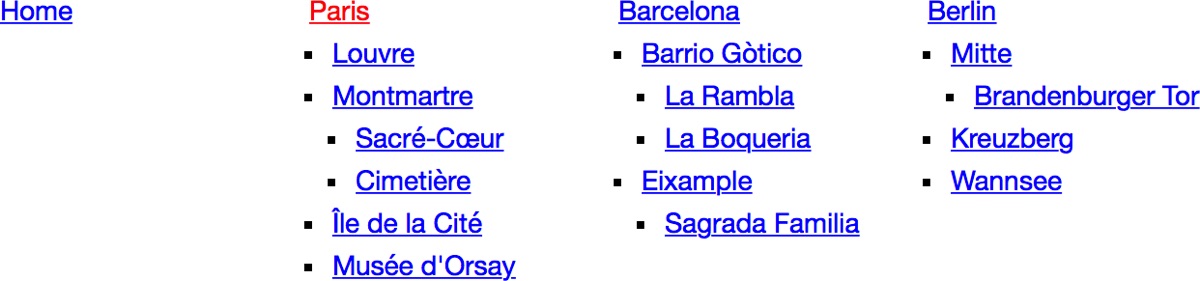
Sitemap shows an overview of all pages and subpages of the website (sitemap). Each entry can be clicked as a link to go to the corresponding page. Pages, with the deactivated property Page > Menu Title, will not appear in the sitemap.
By default, the path & sitemap item begins in the top hierarchy level of the website with the Start Page. The Start Page with sub pages will be displayed in the path & sitemap item.
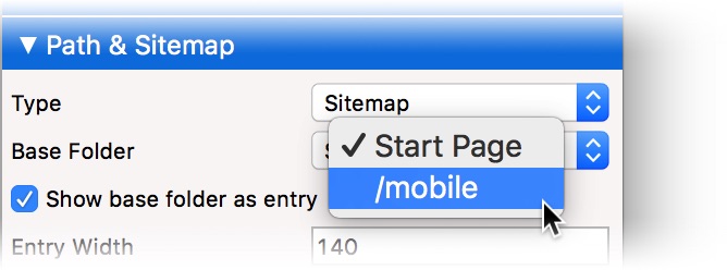
If you want to display a different section of the page hierarchy as the path or sitemap, you can change the base folder in the properties at Path & Sitemap > Base Folder. So you can display only the mobile Start Page with sub pages as the path or sitemap for example.
Properties for Path & Sitemap Items
These properties can be set for a path & sitemap item. Select a path & sitemap item to see its properties.
| Item > Identifier (Id) | Specifies the name of the item in order to address it in animations or as a link target. Use only letters and numbers for the name, no spaces or special characters. |
|---|---|
| Item > Left | Sets the distance in pixels from the left side of the item to the area where the item is located. |
| Item > Top | Sets the distance in pixels from the top side of the item to the area where the item is located. |
| Item > Width | Sets the width of the item in pixels. |
| Item > Height | Sets the height of the item in pixels. |
| Item > Padding Left | Sets the distance from the left side of the item to the content in pixels. |
| Item > Padding Right | Sets the distance from the right side of the item to the content in pixels. |
| Item > Padding Top | Sets the distance from the top side of the item to the content in pixels. |
| Item > Padding Bottom | Sets the distance from the bottom side of the item to the content in pixels. |
| Item > Background Color | Select a background color for the item. |
| Item > Background Picture Clip | Select a background picture from the Fishbeam Clips library. This option is only available if you have the Fishbeam Clips library installed. |
| Item > Background Picture | Select a background picture for the item. With Repeat, you can choose how the picture will be displayed. On Retina websites the background picture will be displayed with double resolution, but half the size (except SVG images). |
| Item > Repeat | Repeats the background picture.
|
| Item > Position Horizontal | Sets the horizontal position of the background picture. If the picture will be repeated, it will be placed once on the specified position and the remaining space on the left, on the right, above and below will be filled. |
| Item > Position Vertical | Sets the vertical position of the background picture. If the picture will be repeated, it will be placed once on the specified position and the remaining space on the left, on the right, above and below will be filled. |
| Item > Fix relative to Browser window | The position of the background picture is calculated on the basis of the browser window. The picture is pined to the window and will not move when scrolling. The picture can be hidden or only parts are visible if it is outside of the visible space. |
| Item > Border Left Width | Displays a border on the left side of the item in the choosen width (pixels). |
| Item > Border Left Color | Select a color for the left border. |
| Item > Border Right Width | Displays a border on the right side of the item in the choosen width (pixels). |
| Item > Border Right Color | Select a color for the right border. |
| Item > Border Top Width | Displays a border on the top side of the item in the choosen width (pixels). |
| Item > Border Top Color | Select a color for the top border. |
| Item > Border Bottom Width | Displays a border on the bottom side of the item in the choosen width (pixels). |
| Item > Border Bottom Color | Select a color for the bottom border. |
| Item > Opacity (%) | Makes the item transparent. From 0% (fully transparent) to 100% (completely visible). |
| Item > Rotation | Rotation of the object in a clockwise direction from 0° to 360°. |
Item > Moving Mouse Over Animation  | Select an animation that you have previously created with an Animation item. The animation will be started as soon as the website visitor moves the mouse over the item. |
| Item > Moving Mouse Out Animation | Select an animation that you have previously created with an Animation item. The animation will be started as soon as the website visitor moves the mouse from the item. |
| Path & Sitemap > Type | Specify what will be displayed.
|
| Path & Sitemap > Base Folder | Choose a page with subpages that appear as the path or sitemap. The default is the Start Page, but you can change this property to display sections or the mobile website. |
| Path & Sitemap > Show base folder as entry | Displays the selected page from Path & Sitemap > Base Folder in the path or sitemap. When you disable this property, only is subpages will be displayed. |
| Path & Sitemap > Entry Width | Sets the width of an entry in the sitemap. |
| Path & Sitemap > Margin Horizontal | Sets the space between two blocks in the Sitemap that are below each other. |
| Path & Sitemap > Font Style | The font style for the list item (sitemap) or the separator (path). Activate a checkbox to set a style attribute and override the global Font Template of the project.
|
| Path & Sitemap > Bulletpoint | Select the bullet for the Sitemap. |
| Path & Sitemap > Padding Left | Sets the space between a list bullet and an entry. |
| Path & Sitemap > Bullet Picture | Choose a bullet picture for the list (only at Bulletpoint: Bullet Picture. |
| Path & Sitemap > Delemiter | Delemiter between two links from the path. The default value is >. |
| Link Style > Font Style | Specifies the font style for links. Activate a checkbox to set a style attribute and override the global Font Template of the project.
|
Visual Effects
You can specify a visual effect, if a website visitor interacts with a link (e.g. change the color if the visitor moves the mouse over the link). The following properties are the same for Moving Mouse Over Link Effect, Clicking on Link Effect and Already Visited Link Effect.
| Effect > Change Font | Changes the font style of a link. |
|---|---|
| Effect > Font Style | Specifies the font style, to which you want to change. Activate a checkbox to set a style attribute and override the global Font Template of the project.
|
Did this help page answer your questions?
If you need additional assistance regarding this topic or if there's missing some information in this chapter, please write us.