


 Mobile Websites
More and more site visitors use mobile devices such as tablets and smartphones to visit your website. That is why Goldfish supports mobile websites.
On mobile devices, all websites are always scaled precisely to the specified Goldfish page width. Normal pages are correctly shown on smartphones but the texts and images are usually too small to be seen closer without zooming.
Goldfish does not support responsive layouts, because the exact placement of objects with a fixed width and height it wouldn't be possible there. In Goldfish you as a designer do have full control over the layout of the website. Instead of responsive pages a special mobile website is created by Goldfish. This is much more flexible because you can choose which content will be shown on the mobile website.

The easiest way to create a mobile website is to enable the checkbox Add page for mobile devices when creating a new project. If you choose a pre-built design, a mobile website will be usually included automatically.
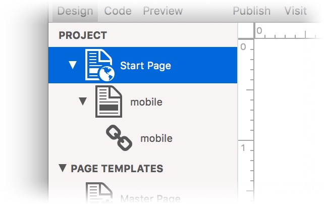
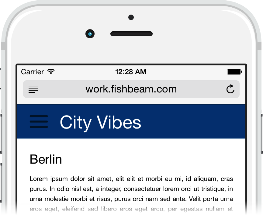
Now you will find the page mobile in the project, to that all website visitors with a smartphone will be forwarded automatically. On the other hand, all website visitors using a tablet or computer remain on the normal website.
Create a page for mobile devices manually
If you want to add a mobile website to an existing project, you will need to create it manually.
- Add a Page Template called Mobile Page and enter 500 as Page Width (min) in the properties. After that, set all margins to 0.
- Add Area Templates like Mobile Header, Mobile Navigation, Mobile Main or Mobile Footer and create the layout for the mobile website in the width of the 500.
- Create a new page below the start page named mobile.html. It acts as the start page for smartphones.
- Select Mobile Page as Page Template and fill the new page with the created Area Templates, to create the layout.
- Disable the Menu Title, so that the mobile page will not appear in the navigation menu of the normal website.
- Create a Navigation Menu Link (+ on the bottom left) and then drag the new link on the mobile start page.
- Select the page /mobile as link taget of the navigation menu link. This is needed to show the mobile start page in a navigation menu for the mobile website.
- Now set up the redirection from the start page. Go to the start page.
- Activate Redirection> Redirection in the properties and select /mobile as the redirection destination. Choose the condition Device is Smartphone at Redirection > Condition.
All website visitors with a smartphone will be redirected to /mobile now. If you create pages and content on the normal website, you have to create also a corresponding page below /mobile and place the content with copy and paste on it.
The Drawer Menu
Since there is usually no space for a regular menu on a mobile website, there are is a special navigation menu for mobile websites in Goldfish.
- Drag a menu on an Area Template for the mobile website.
- Change Menu > Menu Type to Drawer Menu in the properties.
- In addition, choose /mobile as Menu > Base Folder.
The menu will open with a touch on the menu icon and will display all mobile pages.
Properties of Pages for Mobile Devices
A Page offers special features for mobile devices. For example, you can specify a home screen icon, hide the navigation bar or disable Pinch and Zoom.

Read the chapter Pages and Page Templates to learn more about this.
Did this help page answer your questions?
If you need additional assistance regarding this topic or if there's missing some information in this chapter, please write us.