


 Text
Text
Fill your website with content and add text.
You can add a text box to every page area or area template. To add a text box, edit the content of a page area or area template and drag the text box from the items to the editor.

A text box displays text. Double click on it and you can edit the text. In the text edit mode, the properties change. Select text and click on Edit Text > Font Style > Choose... to change the font style, alignment and size.

The font style is set by the selected font template. Activate a checkbox to overwrite the style property with your own values.
 If you use a main style on every page and in every text box, it is better to change the default text template instead of overwriting the style in every text box. Choose nothing (the project properties appear) and click on Project > Font Templates > Choose....
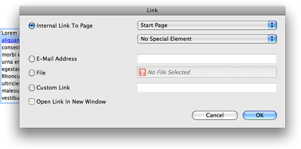
Another important feature on websites is to add links. Select text and activate Edit text > Use as link on the properties panel. Click on Choose... to set the link destination.
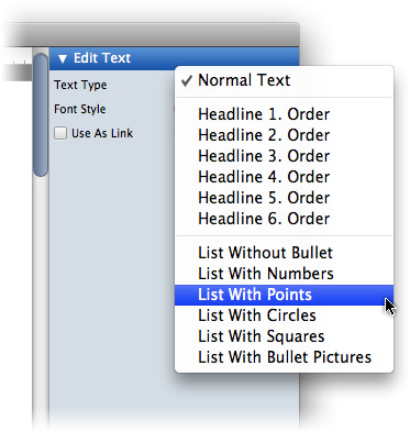
It is important to set the semantical meaning of your text. Search engines like google handle headlines different than normal text. Select the text type at Edit Text > Text Type
- Healine 1 - Headline 6: The selected text is a headline. This changes not the style. This is important for search engines.
- List: The selected text is part of a list. Every new line is a seperate list item. A bullet can displayed before every list item.

Maybe you want to use uncommon fonts for headlines and other text. Usually you can't do this at websites, because the font must be installed on the visitor's computer. If you use uncommon fonts it probably won't be displayed correctly.
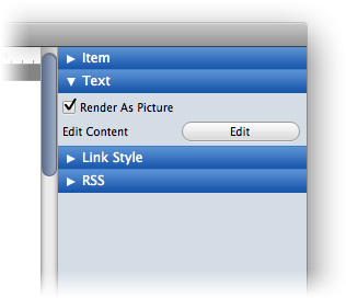
If you use uncommon fonts, activate Text > Render As Picture in the properties. Goldfish creates a picture then with the text in the choosen font. It will be displayed on all computers. Even if the font is missing there.
It is not recommended to use this option for long text. Use this only for headlines. Otherwise the size of your website will grow rapidly.
Properties for Text
These properties can be set for a text box. Select a text box to show its properties.
| Item > Left | Sets the distance from the left side of the parent element in pixels. |
|---|---|
| Item > Top | Sets the distance from the top side of the parent element in pixels. |
| Item > Width | Sets the width of the item in pixels. |
| Item > Height | Sets the width of the item in pixels. |
| Item > Padding Left | Sets the distance from the left side of the item to the content in pixels. |
| Item > Padding Right | Sets the distance from the right side of the item to the content in pixels. |
| Item > Padding Top | Sets the distance from the top side of the item to the content in pixels. |
| Item > Padding Bottom | Sets the distance from the bottom side of the item to the content in pixels. |
| Item > Background Color | Select a background color for the item. |
| Item > Background Picture Clip | Select a background picture from the Goldfish Clips library. This option is only available if you have the Goldfish Clips library installed. |
| Item > Background Picture | Select a background picture for the item. With Repeat, you can choose how the picture will be displayed. |
| Item > Border Left Width | Displays a border on the left side of the item in the choosen width (pixels). |
| Item > Border Left Color | Select a color for the left border. |
| Item > Border Right Width | Displays a border on the right side of the item in the choosen width (pixels). |
| Item > Border Right Color | Select a color for the right border. |
| Item > Border Top Width | Displays a border on the top side of the item in the choosen width (pixels). |
| Item > Border Top Color | Select a color for the top border. |
| Item > Border Bottom Width | Displays a border on the bottom side of the item in the choosen width (pixels). |
| Item > Border Bottom Color | Select a color for the bottom border. |
Item > Add HTML Code  | Add custom html code to the item to extend Goldfish's functionality. |
| Item > Add CSS Code | Add custom css code to the item. The code will be stored in the css section of your website. You can't change the css code of internal items, but you can use the css code in your custom html code. |
| Item > Identifer (Id) | Sets the value for the id property. You can use this id to access the item with JavaScript. |
| Text > Render as picture | Renders the text as a picture, so that you can use uncommon fonts. |
| Text > Edit Content | Starts the edit mode of a text box. |
| Link style > Font style | Sets the font style for links. |
Visual Effects
You can specify a visual effect, if the visitor interacts with a link (e.g. change the color if the visitor moves his mouse over the link). The following properties are the same for Moving mouse over link effect, Clicking on link effect and Already visited link effect.
| Effect > Change font | Changes the font style of a menu item. |
|---|---|
| Effect > Font style | Sets the font style, to which will be changed. |
RSS
The following properties are only visible if the page has a rss news feed.
| RSS > Add text to feed | Adds the text box to the news feed of a page. |
|---|---|
| RSS > Title of the entry | The title of the news feed entry. |
| RSS > Date | The date, when the entry of the feed is published. |
Properties for Edit Text
These properties can be set in the edit mode of a text box. Select a text box and double click on it to start the edit mode.
| Edit text > Text type | Sets the semantic meaning for selected text (normal text, headlines or list). |
|---|---|
| Edit text > Padding left | The selected text belongs to a list it sets the space between the list bullet and the text. |
| Edit text > Bullet picture | Choose a bullet picture for the list (only at Text type: List with bullet picture). |
| Edit text > Font style | Sets the font style for selected text. |
| Edit text > Use as link | Use the selected text as link e.g. to another website. |
Did this help page answer your questions?
If you need additional assistance regarding this topic or if there's missing some information in this chapter, please write us.