


 Navigation Menu
Add a navigation menu to your website. A navigation menu is the most important element what visitors can use to navigate at your website.
You can add a navigation menu to every page area or area template. To add a navigation menu, edit the content of a page area or area template and drag the navigation menu from the items to the editor.

Usually you should add a navigation menu to an area template and use this area template on every page of your website. So the navigation menu is displayed on every page of your website at the same place.
The navigation menu shows automatically the pages of your website as menu entries. Usually there is one entry for every page of your website. The shown text is always the Page > Menu Title property of a page.

To change the text, select the corresponding page and edit the Page > Menu Title property of the page. If you deselect Page > Menu Title, the page does not appear in the navigation menu.
 It is not possible to add a link manually to a navigation menu. The navigation menu shows always automatically the pages of your website.
There are several types of navigation menus. You can set the type in the properties at Menu > Menu Type.
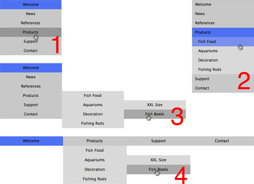
- Simple Menu (1): Shows only one hierarchy level of pages. It displays no submenu. If your website has pages with sub pages, you need a second navigation menu for them.
- Menu with Submenu (2): Shows only two hierarchy levels of pages. It displays one submenu. If you click on a page with sub pages, the submenu appears directly under the main menu entry of the page.
- Dropdown Menu right (3): Shows all hierarchy levels of pages in a menu structure. If the visitors of your website move the mouse over a menu entry of a page with subpages, a submenu will pop up.
- Dropdown Menu bottom (4): Shows all hierarchy levels of pages in a menu structure. If the visitors of your website move the mouse over a menu entry of a page with subpages, a submenu will pop up.

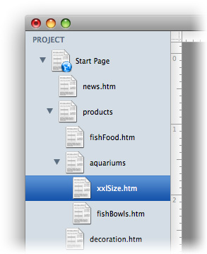
By default, the main menu shows the first hierarchy level of pages (the start page and their sub pages are shown). If you want to create a navigation menu that shows pages from another level, change the property Menu > Base Folder. Here are all pages listed, that have sub pages. E.g. if you select products in this example, products and all it's sub pages are shown.
If you change the size of the menu item, so that there is enough space, the menu entries are displayed side by side.
Properties for Navigation Menu
These properties can be set for a navigation menu. Select a navigation menu to show its properties.
| Item > Left | Sets the distance from the left side of the parent element in pixels. |
|---|---|
| Item > Top | Sets the distance from the top side of the parent element in pixels. |
| Item > Width | Sets the width of the item in pixels. |
| Item > Height | Sets the width of the item in pixels. |
| Item > Padding Left | Sets the distance from the left side of the item to the content in pixels. |
| Item > Padding Right | Sets the distance from the right side of the item to the content in pixels. |
| Item > Padding Top | Sets the distance from the top side of the item to the content in pixels. |
| Item > Padding Bottom | Sets the distance from the bottom side of the item to the content in pixels. |
| Item > Background Color | Select a background color for the item. |
| Item > Background Picture Clip | Select a background picture from the Goldfish Clips library. This option is only available if you have the Goldfish Clips library installed. |
| Item > Background Picture | Select a background picture for the item. With Repeat, you can choose how the picture will be displayed. |
| Item > Border Left Width | Displays a border on the left side of the item in the choosen width (pixels). |
| Item > Border Left Color | Select a color for the left border. |
| Item > Border Right Width | Displays a border on the right side of the item in the choosen width (pixels). |
| Item > Border Right Color | Select a color for the right border. |
| Item > Border Top Width | Displays a border on the top side of the item in the choosen width (pixels). |
| Item > Border Top Color | Select a color for the top border. |
| Item > Border Bottom Width | Displays a border on the bottom side of the item in the choosen width (pixels). |
| Item > Border Bottom Color | Select a color for the bottom border. |
Item > Add HTML Code  | Add custom html code to the item to extend Goldfish's functionality. |
| Item > Add CSS Code | Add custom css code to the item. The code will be stored in the css section of your website. You can't change the css code of internal items, but you can use the css code in your custom html code. |
| Item > Identifer (Id) | Sets the value for the id property. You can use this id to access the item with JavaScript. |
| Menu > Base Folder | Select a page with subpages that will be shown as main menu entries. By default the start page is displayed but you can change this property to create submenus. |
| Menu > Show Base Folder as Menu Entry | Shows the selected page from Menu > Base Folder in the main menu. If you disable this, only its sub pages will be shown. |
| Menu > Highlight Parent Entry | If you are on a page from the sub menu, the menu entry of its parent page will be highlighted, too. If you deactivate this, only the entry of the current page will be highlited. |
| Menu > Menu Type | Sets the menu type for a page. You can choose between:
|
| Menu > Margin Horizontal | Sets the space between the bottom of a menu entry and the top of the next entry. |
| Menu > Margin Vertical | Sets the space between the right of a menu entry and the left of the next entry. |
Main Menu Entry and Submenu Entry
The following properties are the same for Main Menu Entry and Submenu Entry. Note that Submenu Entry will only be visible, if you don't choose Simple Menu at Menu > Menu Type. Because a simple menu has no sub menu.
| Menu Entry > Width | Sets the width of a menu entry in pixels. |
|---|---|
| Menu Entry > Height | Sets the height of a menu entry in pixels. |
| Menu Entry > Alignment | Sets the alignment of the text in a menu entry. |
| Menu Entry > Font Style | Sets the font style of the text in a menu entry. |
| Menu Entry > Padding Left | Sets the distance from the left side of a menu entry to the content in pixels. |
| Menu Entry > Padding Right | Sets the distance from the right side of a menu entry to the content in pixels. |
| Menu Entry > Padding Top | Sets the distance from the top side of a menu entry to the content in pixels. |
| Menu Entry > Padding Bottom | Sets the distance from the bottom side of a menu entry to the content in pixels. |
| Menu Entry > Background Color | Select a background color for a menu entry. |
| Menu Entry > Background Picture Clip | Select a background picture from the Goldfish Clips library. This option is only available if you have the Goldfish Clips library installed. |
| Menu Entry > Background Picture | Select a background picture for a menu entry. With Repeat, you can choose how the picture will be displayed. |
| Menu Entry > Border Left Width | Displays a border on the left side of a menu entry in the choosen width (pixels). |
| Menu Entry > Border Left Color | Select a color for the left border. |
| Menu Entry > Border Right Width | Displays a border on the right side of a menu entry in the choosen width (pixels). |
| Menu Entry > Border Right Color | Select a color for the right border. |
| Menu Entry > Border Top Width | Displays a border on the top side of a menu entry in the choosen width (pixels). |
| Menu Entry > Border Top Color | Select a color for the top border. |
| Menu Entry > Border Bottom Width | Displays a border on the bottom side of a menu entry in the choosen width (pixels). |
| Menu Entry > Border Bottom Color | Select a color for the bottom border. |
Visual Effects
You can specify a visual effect, if a visitor of your website interacts with the navigation menu (e.g. change the color if the visitor moves the mouse over the menu item). The following properties are the same for Moving mouse over link effect, Clicking on link effect and Already visited link effect.
| Effect > Change Font | Changes the font style of a menu item. |
|---|---|
| Effect > Font Style | Sets the font style, to which will be changed. |
| Effect > Change Background | Changes the background of a menu item. |
| Effect > Background Color | Select a background color for a menu entry. |
| Effect > Background Picture Clip | Select a background picture from the Goldfish Clips library. This option is only available if you have the Goldfish Clips library installed. |
| Effect > Background Picture | Select a background picture for a menu entry. With Repeat, you can choose how the picture will be displayed. |
| Effect > Change Border | Changes the border of a menu item. |
| Effect > Border Left Width | Displays a border on the left side of a menu entry in the choosen width (pixels). |
| Effect > Border Left Color | Select a color for the left border. |
| Effect > Border Right Width | Displays a border on the right side of a menu entry in the choosen width (pixels). |
| Effect > Border Right Color | Select a color for the right border. |
| Effect > Border Top Width | Displays a border on the top side of a menu entry in the choosen width (pixels). |
| Effect > Border Top Color | Select a color for the top border. |
| Effect > Border Bottom Width | Displays a border on the bottom side of a menu entry in the choosen width (pixels). |
| Effect > Border Bottom Color | Select a color for the bottom border. |
| Effect > Change Padding | Changes the padding of a menu item. |
| Effect > Padding Left | Sets the distance from the left side of a menu entry to the content in pixels. |
| Effect > Padding Right | Sets the distance from the right side of a menu entry to the content in pixels. |
| Effect > Padding Top | Sets the distance from the top side of a menu entry to the content in pixels. |
| Effect > Padding Bottom | Sets the distance from the bottom side of a menu entry to the content in pixels. |
Did this help page answer your questions?
If you need additional assistance regarding this topic or if there's missing some information in this chapter, please write us.