


 Gallery
With a gallery you can present dozens of photos to the visitors of your website in a slide show.
You can add a gallery to every page area or area template. To add a gallery, edit the content of a page area or area template and drag the gallery from the elements panel to the editor.
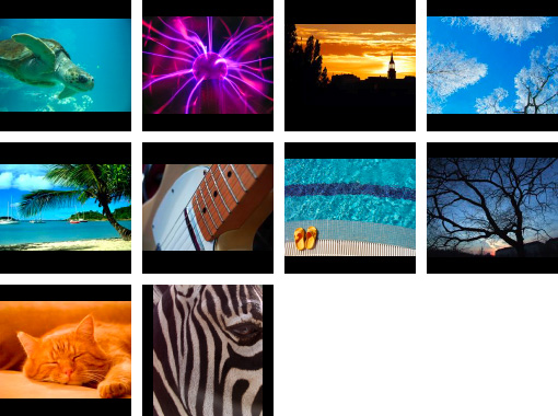
A gallery shows a range of pictures as thumbnails. The visitor of your website can click on each thumbnail to see a larger version. Optional you can add a slideshow, so that the next picture will loaded automatically.
To add pictures to your gallery, click on Gallery > Read from folder > Choose... and open the folder with the pictures from your harddisk. The media import window apprears for each picture.
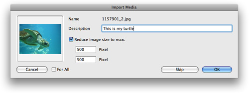
If you have large pictures (e.g. from a digital camera), you should reduce the size to max. 700 x 700 pixels. You can enter a description for every picture if you want. Check For All if you don't want to pop up the media import window for every picture again.
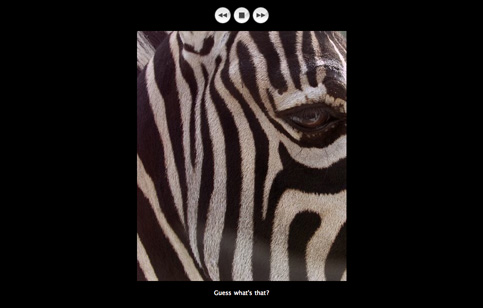
If a visitor of your website clicks on a thumbnail, the larger version of the picture will be loaded on the presentation page. Let's edit the style for this page. Enter a title for your gallery: Edit the text at Gallery > Title in the properties pane. The title is shown in the titlebar of the presentation page.
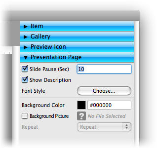
If you want to load pictures automatically in a slide show, you can enable Presentation Page > Slide Pause (Sec.) on the properties pane and enter a time in seconds. Otherwise deactivate this option. If you want to show the comments, which you have entered in the media import window, below every picture, check Presentation Page > Show Description.
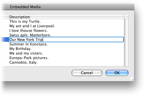
To change a comment for a picture, click in the white space of the project list (nothing will be selected) and click on Project > Embedded Media in the properties pane. Here you can edit the comments of all media files of your website.
Properties for Gallery
These properties can be set for a gallery. Select a gallery to show its properties.
| Item > Left | Sets the distance from the left side of the parent element in pixels. |
|---|---|
| Item > Top | Sets the distance from the top side of the parent element in pixels. |
| Item > Width | Sets the width of the item in pixels. |
| Item > Height | Sets the width of the item in pixels. |
| Item > Padding Left | Sets the distance from the left side of the item to the content in pixels. |
| Item > Padding Right | Sets the distance from the right side of the item to the content in pixels. |
| Item > Padding Top | Sets the distance from the top side of the item to the content in pixels. |
| Item > Padding Bottom | Sets the distance from the bottom side of the item to the content in pixels. |
| Item > Background Color | Select a background color for the item. |
| Item > Background Picture | Select a background picture for the item. With "Repeat", you can choose how the picture will be displayed. |
| Item > Border Left Width | Displays a border on the left side of the item in the choosen width (pixels). |
| Item > Border Left Color | Select a color for the left border. |
| Item > Border Right Width | Displays a border on the right side of the item in the choosen width (pixels). |
| Item > Border Right Color | Select a color for the right border. |
| Item > Border Top Width | Displays a border on the top side of the item in the choosen width (pixels). |
| Item > Border Top Color | Select a color for the top border. |
| Item > Border Bottom Width | Displays a border on the bottom side of the item in the choosen width (pixels). |
| Item > Border Bottom Color | Select a color for the bottom border. |
Item > Add HTML Code  | Add custom html code to the item to extend Goldfish's functionality. |
| Item > Add CSS Code | Add custom css code to the item. The code will be stored in the css section of your website. You can't change the css code of internal items, but you can use the css code in your custom html code. |
| Item > Identifer (Id) | Sets the value for the "id" property. You can use this id to access the item with JavaScript. |
| Gallery > Read From Folder | Select a folder with pictures from your harddisk. |
| Gallery > Title | The title of your gallery. It is shown on the presentation page in the title bar of the web browser. |
| Preview Icon > Icon width (max) | Sets the maximal with of a thumbnail. Maximal because the picture is resized in aspect ratio. |
| Preview Icon > Icon height (max) | Sets the maximal height of a thumbnail. Maximal because the picture is resized in aspect ratio. |
| Preview Icon > Margin horizontal | Sets the space between the bottom of a thumbnail and the top of the next thumbnail. |
| Preview Icon > Margin vertical | Sets the space between the right of a thumbnail and the left of the next thumbnail. |
| Preview Icon > Padding Left | Sets the distance from the left side of a thumbnail to the content in pixels. |
| Preview Icon > Padding Right | Sets the distance from the right side of a thumbnail to the content in pixels. |
| Preview Icon > Padding Top | Sets the distance from the top side of a thumbnail to the content in pixels. |
| Preview Icon > Padding Bottom | Sets the distance from the bottom side of a thumbnail to the content in pixels. |
| Preview Icon > Background Color | Select a background color for a thumbnail. |
| Preview Icon > Background Picture | Select a background picture for a thumbnail. With "Repeat", you can choose how the picture will be displayed. |
| Preview Icon > Border Left Width | Displays a border on the left side of a thumbnail in the choosen width (pixels). |
| Preview Icon > Border Left Color | Select a color for the left border. |
| Preview Icon > Border Right Width | Displays a border on the right side of a thumbnail in the choosen width (pixels). |
| Preview Icon > Border Right Color | Select a color for the right border. |
| Preview Icon > Border Top Width | Displays a border on the top side of a thumbnail in the choosen width (pixels). |
| Preview Icon > Border Top Color | Select a color for the top border. |
| Preview Icon > Border Bottom Width | Displays a border on the bottom side of a thumbnail in the choosen width (pixels). |
| Preview Icon > Border Bottom Color | Select a color for the bottom border. |
| Presentation Page > Slide Pause (Sec) | Sets how long a pictures is shown in the slideshow. Deactivate this to have no slideshow. |
| Presentation Page > Show Description | Shows the comment of a picture below the large version picture on the presentation page. |
| Presentation Page > Font Style | Sets the font style for the presentation page. |
| Presentation Page > Background Color | Select a background color for the presentation page. |
| Presentation Page > Background Picture | Select a background picture for the presentation page. With "Repeat", you can choose how the picture will be displayed. |
Konnte diese Hilfeseite Ihre Fragen beantworten?
Wenn Sie zu diesem Thema noch weitere Hilfe benötigen oder in diesem Kapitel eine Information fehlt, schreiben Sie uns.